Making text readable on photos
Most carousels are viewed on a phone, often for a second or two per slide. Text that is easy to read in that moment comes down to four things: contrast, size, placement and length.
Contrast comes first
Text needs to stand apart from what is behind it. Light text works on dark areas, dark text on light areas. Busy photos with lots of detail make any text harder to read. Some practical fixes:
- Place text over a calm area of the photo, such as sky, a wall or a table top.
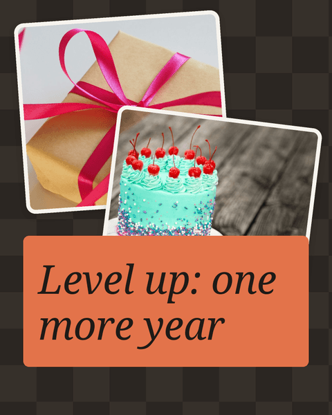
- Add a solid shape behind the text and use layers to keep it underneath the words.
- Use a plain background color on text-heavy pages and keep photos for other slides.
- Crop the photo so a quieter part sits where the text goes.
Size it for a phone
What looks large on a computer screen can look tiny on a phone. Make headings big enough to read at a glance and avoid very thin font weights over photos. A good habit is to zoom out in the editor until the page is roughly phone size, then check whether you can still read every word comfortably.
Keep a clear difference between a heading and supporting text, so the eye knows where to start.
Place text with care
- Avoid faces and key details. Text across someone's eyes or over the product hides the very thing people want to see.
- Leave space from the edges. Platforms sometimes show buttons, captions or profile details near the top and bottom, especially in full-screen 9:16 formats.
- Keep a consistent position. If the heading is top-left on one slide, keep it there on the next.
- Align with intention. Left-aligned text is usually easiest for longer lines; centered text suits short titles.
Write short copy
People swipe quickly. Aim for one idea per slide and as few words as possible. Some tips:
- Lead with the most important word.
- Prefer short, everyday words.
- Break a long sentence into two slides rather than shrinking the font.
- Move extra detail into the post caption.
Reading the text aloud is a useful test: if a slide takes more than a breath to say, it is probably too long. If you are building a how-to or tips carousel, the guide on carousel ideas for small businesses shows how to split information across pages.
A quick final check
Before exporting, step through every page and ask: can I read this in two seconds on a small screen? If not, raise the contrast, increase the size, move the text or cut words. Also check the exported files on your own phone, since JPEG and PNG both keep text sharp but a real screen is the best judge.
Quick answers
What is the easiest way to fix text that is hard to read?
Put a solid shape or a plain background color behind it, then use layers so the shape stays under the words.
Should I export as JPEG or PNG for text-heavy slides?
Both work. PNG avoids compression artifacts around sharp edges, while JPEG files are usually smaller. Try both and compare on your phone.